


Kiandra Insights
Designing for accessibility series


Accessibility is an important part of web design and software development and one of the keys to creating a more inclusive society. We have created a series of resources to help make your digital elements more accessible to all.
By making your website accessible, you are ensuring that all of your potential users, including people with disabilities, have an equal user experience and are able to easily access your information. By implementing accessibility best practices, you are also improving the usability of the site for all users.

Accessibility for dyslexia
According to the Web Accessibility Initiative (WAI): "Cognitive and learning disabilities impact how people process information. For example, they can affect people’s perception, memory, language, attention, problem-solving, and comprehension."
In digital accessibility, dyslexia is often overlooked as the focus tends to be on vision- and hearing-related disabilities. However, learning disorders can also affect online experiences and certainly deserve consideration. We’ve put together a list of what to be aware of when designing for users with dyslexia.
Designing for users with dyslexia
- Allow the user to customise their view for their preferences e.g., colours, fonts and text size.
- Use a sans-serif font as these are easier to read for individuals with dyslexia.
- Use a larger font size, a minimum of 16 pixels.
- Reinforce text with icons or visual cues so a reader can scan a page without reading all the text.
- User dark grey instead of black on a white background as this is easier on the eye.
- Left justify your text.
- Have multiple navigation options so there are a variety of ways to get to the same place.
- Provide a site map (predictably at the bottom of the page) to give all users the chance to see all options and to choose where they want to go next.
- Make your content clear, and concise and use short sentences and text areas.
- Provide information in numbered or bulleted lists as these are predictable and easily digestible.
- Maximum line length should be 80 characters.
- Avoid italics and underlines and use bold text for emphasis instead.
- Avoid carousels and rotating text and give users an opportunity to read and digest information at their own pace.
- If you provide a search bar, ensure that it is equipped to handle misspellings.
We have created an infographic to help illustrate what to be aware of when designing and developing for people with dyslexia: Designing for users with dyslexia
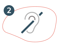
Accessibility for auditory disabilities
Designing for those deaf and hard-of-hearing can be easy and inexpensive, for example, the most common solution is adding captions whenever a sound appears. Essentially, making a website, or software more accessible to those experiencing deafness or hearing loss, makes your digital spaces more accessible, and you’ll reach more people. We’ve put together a list of what to be aware of when designing for users with auditory disabilities.
Designing for users that are deaf and hard-of-hearing
- Include closed captioning on all video content.
- Test accuracy and synchronisation of captions with audio.
- Identify different speakers in video subtitles or transcripts.
- Make a volume control available on video, including mute and unmute.
- Use the correct decibel levels to ensure any audio is clear.
- Ensure audio is of high quality by avoiding poor microphones and background noise.
- Thoughtful placement of captioning so it does not obscure content on the page.Allow users to change the caption font size, colour and background.
- Make it clear to a user that caption controls are available by placing them in a predictable location.
- Consider providing transcripts of video content.
- Don't make the telephone the only method of contact.
- Allow people to specify how they want to be contacted by asking for a preferred communication method.
- If face-to-face interaction is required, allow the user to request communication support or advise that they are bringing their own support.
- Write in plain English as it’s a second language to sign language users.
- Design a linear and logical layout.
- Provide alternatives to audio-only notifications or alerts.
- When designing for mobile, ensure you cater to device accessibility options to leverage the phone’s functionality.
We have created an infographic to help illustrate what to be aware of when designing and developing for people deaf or hard of hearing: Designing for users that are deaf and hard-of-hearing

Accessibility for blind, low-vision or colour blind
Web experiences are inherently visual and the internet is full of sites, tools, and apps that are practically unusable for people with visual impairments. For example, it’s not uncommon to see websites that use combinations of background and foreground colours that make pages virtually unreadable for colour blind users. Despite all this, people with visual impairments use the web every day to surf, read and write emails, and do anything else anyone can conceivably do on the internet. Designing for the visually impaired will make it easier for everyone.
Designing for users that are blind, have low-vision or are colour blind
- Allow users to adjust the font size of the text.
- Avoid using images with text in the image, make the text an element instead.
- Avoid using text or elements that are smaller than 16 pixels.
- Avoid justified paragraph text.
- Don't write in all caps especially if under 20 pixels.
- Make buttons and link text clear and meaningful.
- Give feedback when an action is performed such as when a button is clicked, display some visual stimuli to inform the user that an action has been successful.
- Avoid large blocks of text and keep paragraph width to less than 80 characters.
- Avoid flashing on the screen.
- Allow users to pause any moving or animated information on a page.
- Ensure a responsive reformatting of content and images and always avoid a horizontal scroll bar.
- Use detailed ‘Alt Text’ on images that thoroughly describe the image.
- Choose a colour palette with a high contrast ratio between the text and the background.
- Be thoughtful with colour choices and avoid forbidden colour pairs such as red and green.
- Allow users to review and correct any inputted information before finalizing a submission.
- Consider using textures in place of colours to differentiate elements on the screen.
- Allow users to switch to the dark mode.
- Avoid using pop-ups, overlaps and modals.
- Provide an audio alternative to video content.
- Pair icons or text with colours to show actions and results, instead of just colour.
- Allow access to colour blind tools and browser extensions.
- Ensure that all functionality that is available by mouse is also available by keyboard commands.
- Design with a screen reader in mind and use headings to organise page content to allow a user to skim the information on a page.
- When designing for mobile, ensure you cater to device accessibility options to leverage the phone’s functionality.
We have created an infographic to help illustrate what to be aware of when designing and developing for people that blind, have low-vision or are colour blind:
Designing for users that blind, have low-vision or are colour blind

Accessibility for anxiety and panic disorders
We’ve all bungled up entering credit card details into a form while a ticking timer counts down the time remaining to complete a transaction. The web is full of these tactics, some are designed to convert you, and gain contact details, while others aim to keep you on the site. Some may find this irritating, but this can be debilitating for people with anxiety or panic disorders.
This is a growing field and for a full breakdown of requirements, we encourage you to read the Web Content Accessibility Guidelines (WCAG).
Essentially, making a website, or software more accessible to those with anxiety or panic disorders, makes your digital spaces more accessible to all, and you’ll reach more people. We’ve put together a list of what to be aware of when designing for users with panic disorders or anxiety.
Designing for users with anxiety and panic disorders
- Be mindful of manipulative content that could cause actions performed out of panic, or stress-buying.
- Avoid negative interactions such as error messages or the ability to get lost in the navigation - these can cause overwhelm.
- Ensure your architecture is straightforward and intuitive.
- Don’t rush users with time limits and give enough time to complete actions.
- Allow users to stop the clock or countdown.
- Don’t leave users confused or unsure about the next steps, results or timeframes.
- Don’t leave users uncertain about the consequences of their actions online and explain what will happen after completing an action.
- Give users the support they need and make it easily accessible.
- Let users check and revise their responses before they submit a form.
- Design a clean and minimal design with thoughtful colours, simple fonts and elements.
- Consider in your design, the emotional response of the user.
- Warn a user if they are about to consume a triggering video or content.
- Allow a user to turn auto-play off.
- Allow a user to manage their notifications and how they are received and displayed.
- Apply ‘positive friction’ to enable a user to back out of action e.g. recall an email, delay a purchase, or re-submit the information.
- Use well-established patterns and familiar conventions.
We have created an infographic to help illustrate what to be aware of when designing and developing for people with anxiety or panic disorder: Designing for users with anxiety and panic disorders
.png)
Accessibility for motor impairments
The most common assistive technologies used by people with a motor impairment are alternative keyboard, head wand, trackball mouse or other alternative devices, mouth stick, single switch devices, speech recognition software, puff and sip devices, eye-tracking technologies, etc. Keep in mind, accessible device controls and features affect the user experience, even more so for someone with a mobility impairment.
Designing for users motor impairments:
- Ensure users are able to navigate through links on an application via keyboard control.
- Many users have difficulty with mouse movements and may also have problems holding down keyboard keys simultaneously. Ensure a good design so these actions can be avoided.
- When designing for mobile, ensure you cater for device accessibility options to leverage the phone’s functionality.
- Face ID or Face Unlock on iOS and Android can be used to fill out passwords on forms, rather than using keyboard entry.
- Make the size of targets and UI controls appropriate for people with mobility impairments. For example, pop-ups often use close buttons that are too small to select.
- Implement a reliable zoom feature that does not distort or make content illegible.
- Consider the time that needs to be spent on a task and don’t rush users to complete an action.
- Allow drop-down menus to stay open if they are clicked on.
- Consider designing for invoice command software and alternative keyboards.
We have created an infographic to help illustrate what to be aware of when designing and developing for people with motor impairments: Designing-for-users-with-mobility-impairments
The full series of posters can also be downloaded as a package.

.svg)
More insights
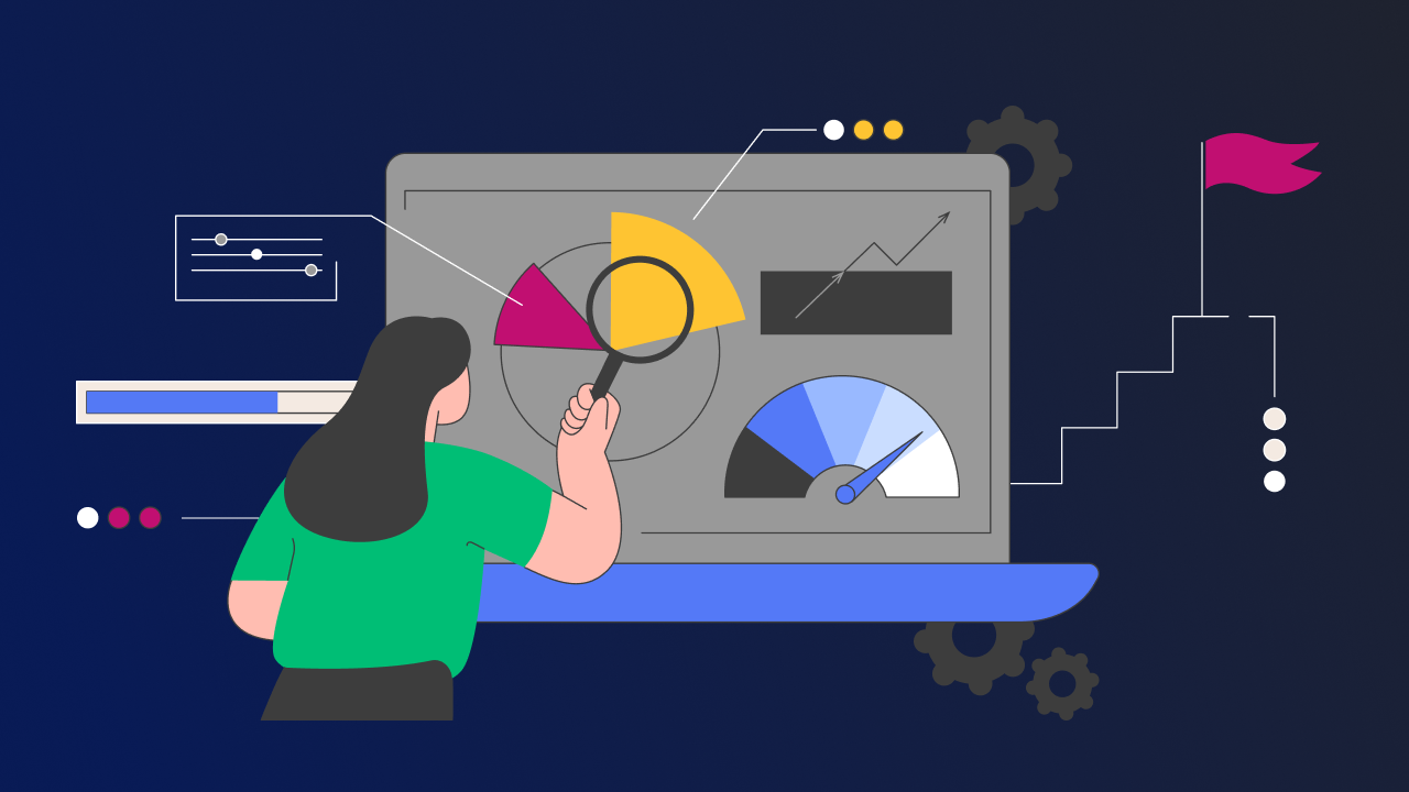
Performance testing is a commitment to excellence
At Kiandra, we recognise and acknowledge the pivotal role of performance testing in achieving this fine balance. In this blog, we will unravel what performance testing truly means at Kiandra and why it's a cornerstone of our development philosophy.

Kiandra becomes first Premier OutSystems partner in the ANZ region
Kiandra are proud to announce that it has attained the status of Premier OutSystems Partner – the most important partnership status from the world’s leading enterprise low-code platform.

OutSystems Top Partner ANZ for 2022
Kiandra has received the OutSystems Partner of the Year Award for the entire Australia New Zealand region. The custom software solutions provider was recognised at the ‘Top Partner of Australia and New Zealand’.
Let’s discuss your next project
Whether you’re curious about custom software or have a specific problem to solve – we’re here to answer your questions. Fill in the following form, and we’ll be in touch soon.


.svg)

